Medical AI Assistant
LLM powered solution that gives patients control over their data, streamlines patient-clinician communication and reduces wait times at clinics.
Product Designer, Frontend Developer
Figma, FigJam, Qualtrics, LucidChart, Mural, Calendly
11 months

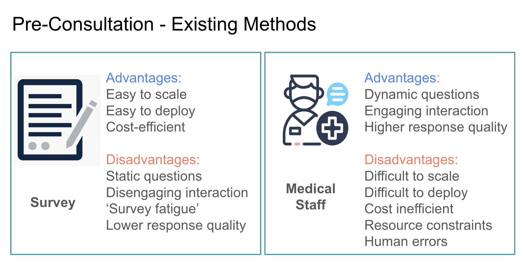
Pre-consultation isn't automated.
Particularly, pre-consultation assessments—the process of collecting relevant medical information before a patient meets the clinician—lack automation due to staff shortages, worsening the issue.
Additionally, in 2024, Toronto had the longest average wait in the province at 72 minutes.
Challenge
No patient-focused system addresses medical personnel shortages, long wait times, low patient engagement and agency in their healthcare.
Solution
An app with general walk-in clinic navigation and an AI-powered chatbot to collect pre-consultation information would address these issues.

Key Performance Indicators
To measure the success of our solution, we initially defined the following key performance indicators:
1. Reduction in patient wait times (Average amount of patients seen daily w/ and w/o Medical AI Assistant).
2. User engagement & satisfaction (measured via System Usability Scale & qualitative feedback).

Research
"My pre-consultation feels rushed, and important information is often lost in the process"
Empathy maps and a storyboard were created upon reviewing relevant literature, conducting user interviews and distributing surveys.


Empathy maps for two types of end-users—patients and clinicians—helped grasp the emotional and practical needs of both groups during the pre-consultation phase.

Storyboard highlighting a real user's story that was obtained during user interviews.
To better understand how to implement the optimal solution to our challenge, it's helpful to analyze how competitors approached this.
Key findings from our competitor analysis include:
"Users desired emotional support, such as greetings, and further treatment suggestions"
The key feature of our solution is a chatbot assistant designed to communicate clearly, ethically, and compassionately.
Relevant literature review provided valuable insights into user preferences for chatbot interactions:
Concept Ideation and Validation
Mind Mapping is a great first step in the ideation process. In a 30-minute brainstorm session, we effectively shared our ideas with each other, highlighting requirements for future wireframes and setting user needs as our priority.

Mind Mapping highlighted user needs and core features of our application to prioritize. This resulted into a better structured crazy 8's sketching process, with a clear focus on the final goal.
At first, this might seem limiting, but in practice, it pushed me to explore as many creative variations of the "Chat - Summary" flow as possible within just 8 minutes.

Crazy 8's design sprints
Mind Mapping is a great first step in the ideation process. In a 30-minute brainstorm session, we managed to share our teams' ideas effectively, highlighting requirements for future wireframes and setting user needs as our priority.
Conceptual prototyping allowed us to refine the application's core features before expanding its functionality. Using the best ideas from the Crazy 8's ideation process, I designed a conceptual prototype to conduct a user study.

Design of core features and registration screens for the user study
Our user study included questionnaires, semi-structured interviews, contextual inquires and detailed observation of user interactions with the prototype, supported by keylogger data.
We gathered insights that validated our concept and suggestions for improving user experience. For instance, some participants suggested using a picture of a person to make the chatbot feel more welcoming. This and other feedback was incorporated into the design of the final product.
" If there's a human picture instead of the robot here, it will look more appealing"

Design Decisions
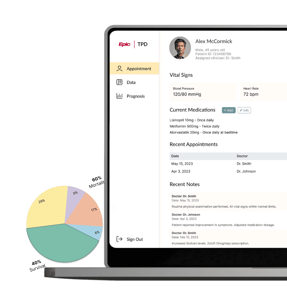
Applications incorporating pre-consultation assessments don’t allow patients to see the generated medical summary, limiting their control over the data used by clinicians.
To address this, a summary review step was included in the chatbot-patient conversation, enhancing data transparency and patient engagement.

One sentence can be summarized in two different ways: paraphrasing quotes into medical terminology or keeping it fairly original with minor grammar changes for readability.
Usability testing revealed that the majority of participants preferred summaries containing their original quotes, highlighting the importance of transparent data handling in medical processes.

To prevent misinterpretations, the summary review and editing features were introduced, allowing patients to make necessary changes before finalizing their summary.

The editing process flow was designed with technical limitations in mind. Summary generation, which involves an API call to the OpenAI server, requires time to process and update. During initial prototype testing, the development team discovered that while Request #1 was resource-intensive and slow, Request #2 proved to be faster and more reliable.
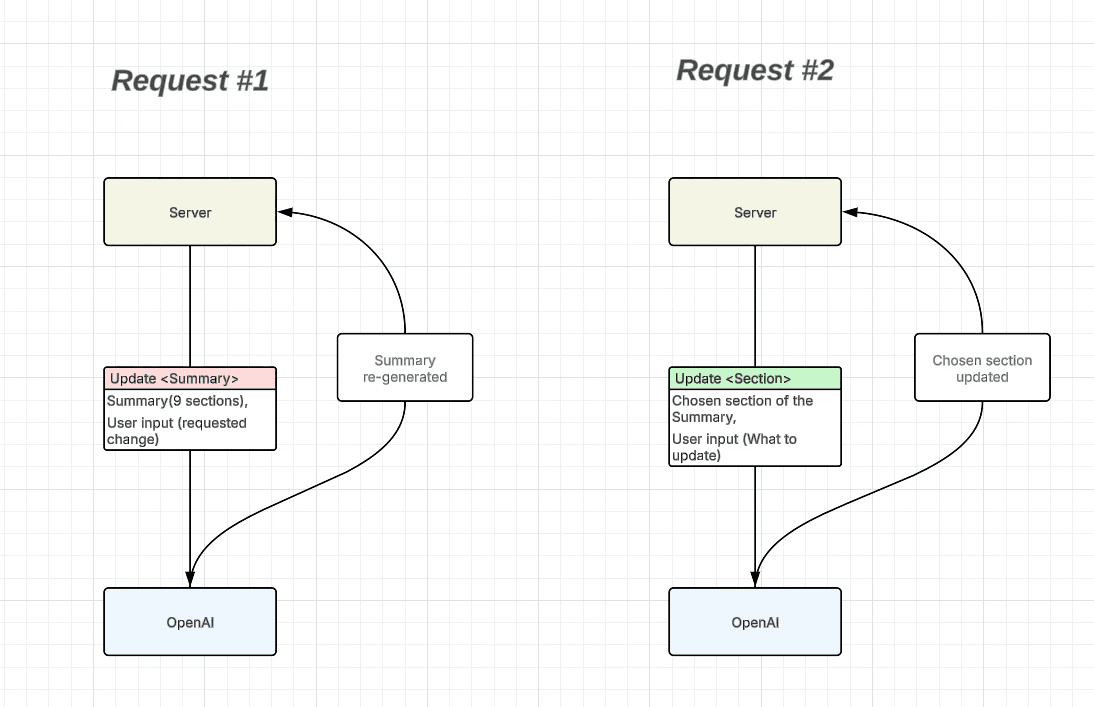
To seamlessly implement Request #2 on the user's side, I decided to incorporate an interaction with isolated field selection and modification.
This decision was made after the first round of usability testing, where users said they felt confused when using the product for the first time. They needed a more guided process.
While thinking of a solution, I reflected on the way many governmental websites use visual guides (progress bars, step lists etc) to minimize the cognitive load of a user and make the process less overwhelming.

So, a progress bar was added to show the next step in the pre-consultation process. Pop-up messages were also included to guide users and keep the flow simple and easy to follow.

Evaluation

Protocol for User Study of the final product
w/o DocReady
w/ DocReady
The average wait time with and without the DocReady app helps evaluate application's impact on staff shortages and long wait times.


General application's efficiency was evaluated in a usability testing session conducted in non-clinical environment using quistionnaire and semi-structured interviews with participants. System Usability Scale was calculated based of 10 questions on a 5-point scale (Strongly Disagree - … - Strongly Agree).

I think I would like to use this system frequently.
I found the system unnecessarily complex.
I thought the system was easy to use.
I think I would need the support of a technical person to use this system.
I found the various functions in this system were well integrated.
I thought there was too much inconsistency in this system.
I would imagine that most people would learn to use this system very quickly.
I found the system very cumbersome to use.
I felt very confident using the system.
I needed to learn a lot of things before I could get going with this system.
During both semi-structured interview sessions and testings at clinic, many valuable insights from participants and patients were captured. Some of them are worth mentioning, since they highlight relevant advantages of AI usage in pre-consultation process.
"This felt more intentional and I felt like I could (if I miss something) ask again or mention it later on."
"Summary is a lot more detailed than when I would normally talk to a nurse before seeing the doctor."
"Reviewing the summary made me realize that I forgot to mention a few things, so I added them in before sending it off."
"It's more helpful, especially compared to the paper form. Chabot is definitely more interactive, personalized."
Final Thoughts
This project was particularly meaningful to me as I was the sole designer on the team. The design process didn’t strictly follow a "by the book" approach (Research, Ideation, Design, Prototyping, Testing); instead, the initial focus was on testing and iterating to create a process that logically evolved as the product developed. Overcoming the challenge of organizing this workflow was a milestone I’m proud of.
Finally, this experience profoundly shifted my perspective on problem-solving, and I found great satisfaction in seeing how each iteration brought meaningful solutions to challenges that resonate universally.
What’s next?
The potential for improving this product is vast. Future features could include general health tips, deeper integration with EMRs for displaying doctor recommendations after the appointment, or even a simple notebook for users to organize their thoughts for their next appointment.
In conclusion, this project highlights the transformative impact modern technologies can have on healthcare, benefiting both providers and patients.
Explore next

Ready to bring your vision to life or just want to chat?
I'm here to listen, collaborate, and design solutions that make impact.
© 2024 by Anna Kirik. All rights reserved.