Prediction Dashboard for Transplant Recipients
Medical Dashboard with ML predictions to improve the decision-making process for transplant physicians.
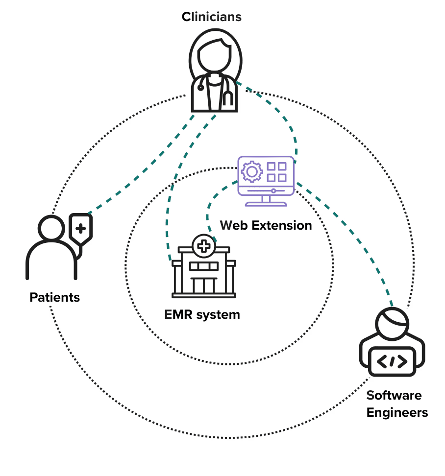
Product Designer, Frontend Developer
Balsamiq, Figma, FigJam, Docker, LucidChart, Miro
10 months

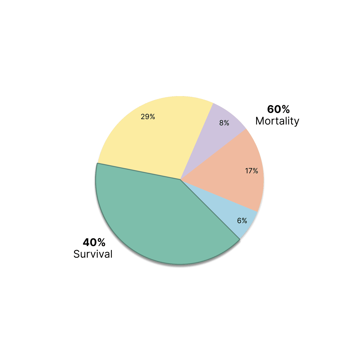
Organ transplant recipients often face health challenges post-surgery
While clinicians can quickly spot organ rejection or infection, long-term challenges are harder to detect. To predict life-threatening outcomes that might occur years later, clinicians rely on monitoring medical data and identifying suspicious changes over time.
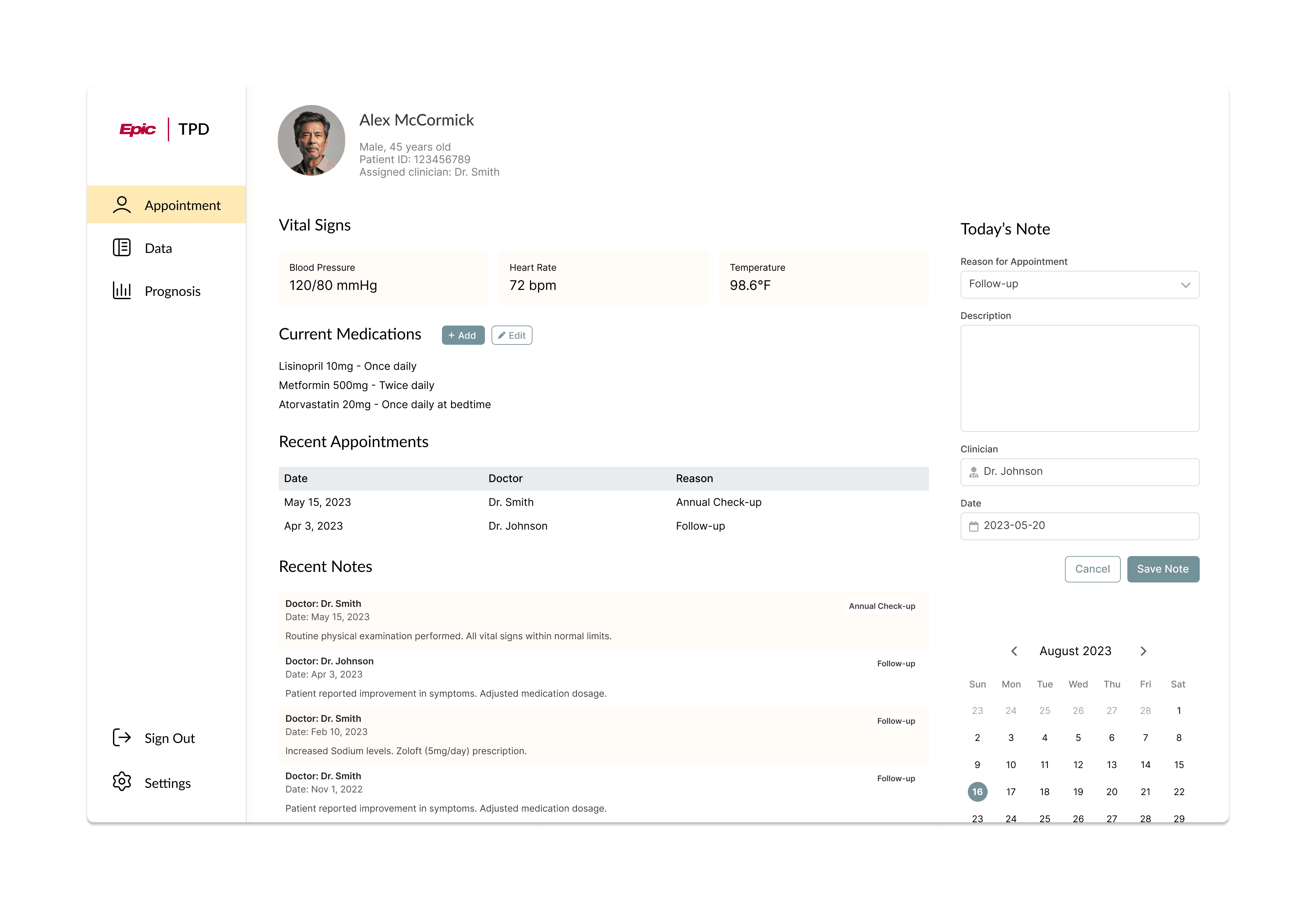
Challenge
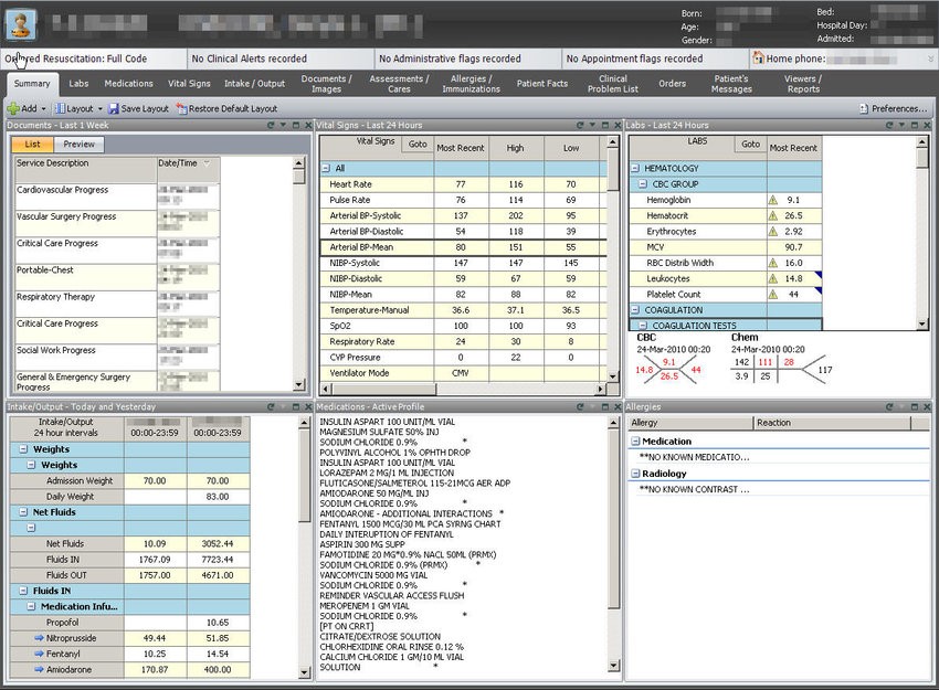
EMR systems collect patient information in general profiles, but specialized hospital departments often struggle to navigate the vast amounts of data, much of which may be irrelevant to their specific needs. This wastes clinicians’ and patients’ time, making it harder for organ transplant practitioners to identify impactful changes in medical data.
Solution
A medical dashboard displaying relevant patient information and changes over time would streamline data navigation for medical personnel. When powered by deep learning algorithms, this solution can also predict long-term complications, improving the overall monitoring of transplant recipients' health.
Research
The first step was conducting expert interviews and literature reviews to understand the nuances of organ transplantation recovery. This phase provided a foundational understanding of the impact every detail of patient’s medical history has on their life post-surgery. We also learnt how troublesome it is for clinicians to gather this data and analyze it as a whole.

By shadowing clinicians and nurses, we observed their daily workflows and interactions, gaining insights into practical needs and system deficiencies. These observations were crucial for developing a user-centric design. Using field observations and previous interviews, we were able to create an affinity map that showcased all the ideas, concerns and needs of developers and end-users.

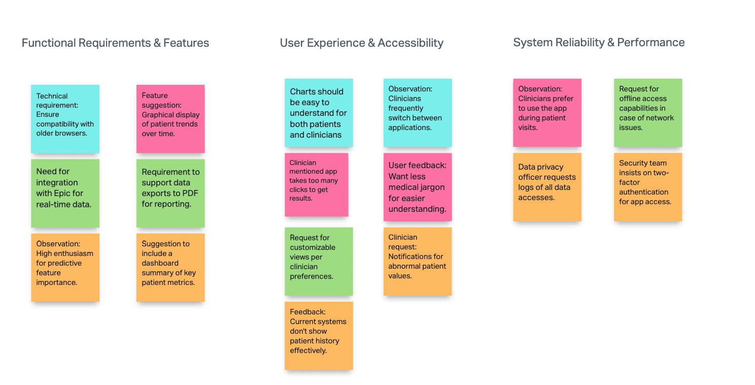
Affinity Map created during shadowing sessions and interviews
Design Decisions
During shadowing sessions and observing patient-clinician interactions, I noticed an interesting behavioural pattern: 6 out of 10 male patients did not take their treatment plans seriously (often being scolded by their doctors).
1) The CDC reports that women are 33% more likely to visit the doctor than men, and are 100% better at maintaining screenings and preventive care.
2) 65% of organ transplant recipients are males.
Considering these statistics, I suggested implementing a patient-focused data visualization screen to encourage patients to take their doctors’ recommendations more seriously. After discussions with both end-users and the client, this feature was approved for implementation.
In feedback sessions, end-users were divided into two groups regarding data table alignment. Senior clinicians, familiar with the older EMR system, preferred a Date-Aligned View of the table, while younger practitioners favoured a Parameter-Aligned View.
This “anchoring bias” influenced our decision to make the alignment customizable.

To prevent misinterpretations, the summary review and editing features were introduced, allowing patients to make necessary changes before finalizing their summary.

To prevent misinterpretations, the summary review and editing features were introduced, allowing patients to make necessary changes before finalizing their summary.

Additionally, we needed to provide "proof" of the predictions’ accuracy through Feature Importance. As few clinicians are familiar with ML and Feature Importance, this information had to be as intuitive as possible. We used A/B/C testing and the Think-Aloud protocol to test the clarity of various designs.

Evaluation

Final Thoughts
This project helped me build fundamental skills in product design:
1) Relate to the user.
2) Make the circumstances work for you.
3) Take initiative.
Collaboration with clinicians was the most challenging part in this journey, so speed prototyping with tools like Balsamiq, FigJam and Figma was really helpful. Also, Miro appeared to be a great tool for idea and feedback organization across designers, developers and clinicians for this project.


Explore next


© 2024 by Anna Kirik. All rights reserved.